A Case Study on Crafting a Bespoke Wallpaper Brand with Elegance and Approachability
To lay the groundwork for WallArt’s branding, I initiated a comprehensive market research and competitive analysis phase. This involved examining the landscape of bespoke wallpaper brands to understand the market dynamics and key players.
During the analysis, I focused on leading brands such as Wall&Deco, Inkiostro Bianco, London Art, Wonderwall, and Glamora. Additionally, I considered luxury brands like de Gournay, Fromental, Cole & Son, and Phillip Jeffries, analyzing their strengths and market positions.
The insights gained from this research revealed opportunities where WallArt could stand out by integrating real, digitized art into home décor. This approach allowed us to offer a unique blend of luxury and approachability, differentiating WallArt from the competition.
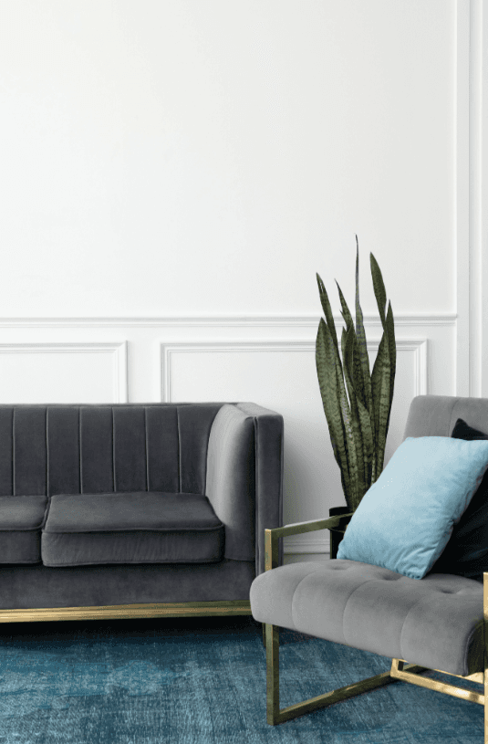
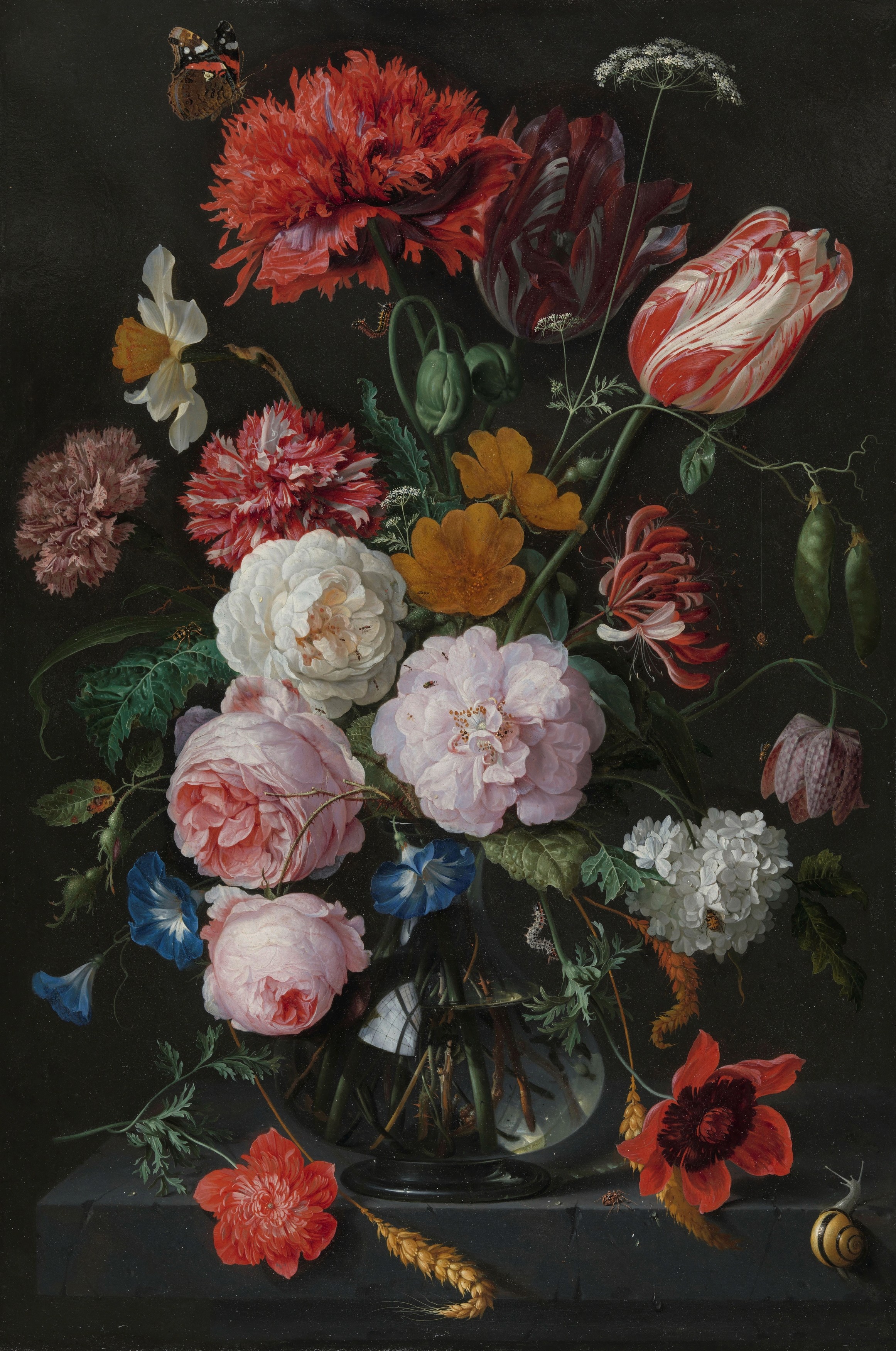
To guide the branding process, I curated a moodboard that encapsulates the core elements of WallArt's aesthetic. Featuring a refined palette of white, black, and gold, alongside carefully selected paintings and interior designs, the moodboard serves as a visual foundation that influenced the logo creation and overall brand identity. This collection of imagery highlights the luxurious yet approachable feel that WallArt aims to convey in every bespoke design.

A crucial aspect of the branding was developing a logo that could serve as a visual cornerstone for the brand.
I focused on creating a logo that not only encapsulated WallArt’s commitment to client collaboration but also possessed the versatility needed for luxurious applications like gold hot stamping.
The chat bubble enclosing the logo symbolized the ongoing dialogue with clients, a key aspect of WallArt’s bespoke services.
The design process ensured that the logo was elegant, minimalist, and adaptable, making it perfect for high-end packaging and print materials.
A black and white palette, chosen for its timeless elegance and ability to convey both sophistication and warmth, serves as the foundation of WallArt's visual identity.
This classic color combination not only enhances readability and focus but also ensures that the brand maintains a refined, contemporary look. Gold foil accents are strategically incorporated to add a luxurious touch, elevating the overall design and making key elements stand out with a subtle yet impactful shine.
These gold accents also help to reinforce the brand’s premium quality, creating a lasting impression of luxury and exclusivity in both digital and print materials.
Our design choices reflect WallArt’s commitment to elegance and clarity. We selected Brant Pro for the body text, ensuring readability with a modern and sophisticated touch. For headers, we chose Next Black, offering boldness and impact, while Playfair Display adds a classic, refined feel to the accent text, perfectly complementing the overall aesthetic of the brand.
We create custom
wallpapers
Podstawą naszego działania jest wrażliwość na piękno otaczającego nas świata i próba przeniesienia go do wnętrz naszych klientów. Przybliżenie kultury, sztuki czy chociażby piękna przyrody oraz dopasowanie go do różnorodnych potrzeb inwestorów jest dla nas bardzo istotne.
We create custom
wallpapers
Mixed
Font Usage
In WallArt’s branding, the strategic combination of fonts enhances both visual appeal and clarity. Below is an example of how Brant Pro is used for body text to maintain readability, Next Black provides strong, impactful headers, and Playfair Display adds a touch of elegance to key highlights and accents. This harmonious mix ensures that every piece of communication is both striking and easy to navigate.
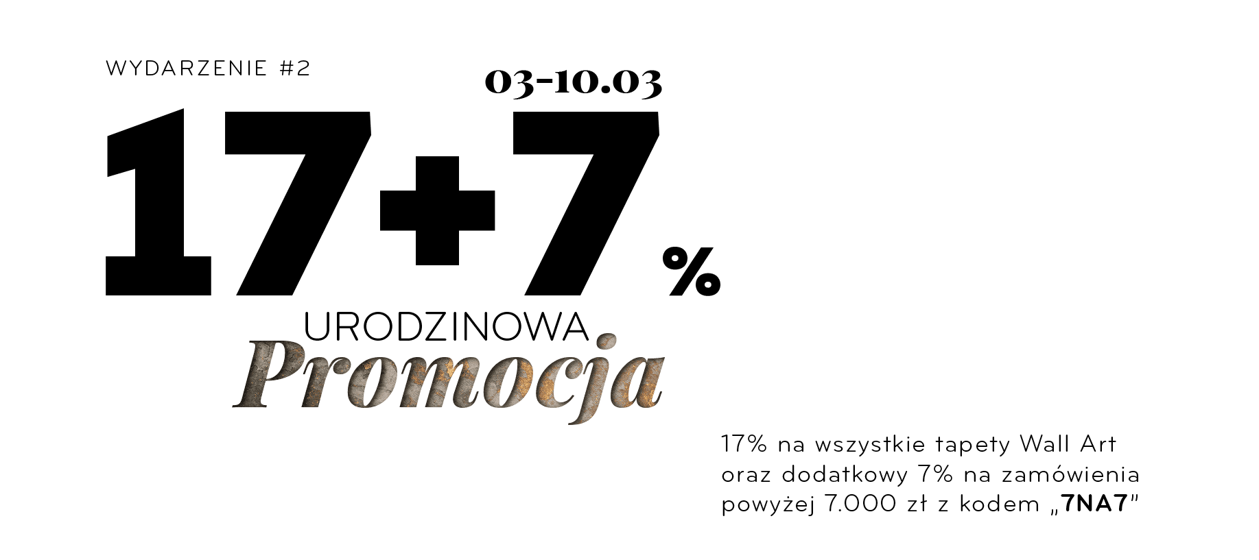
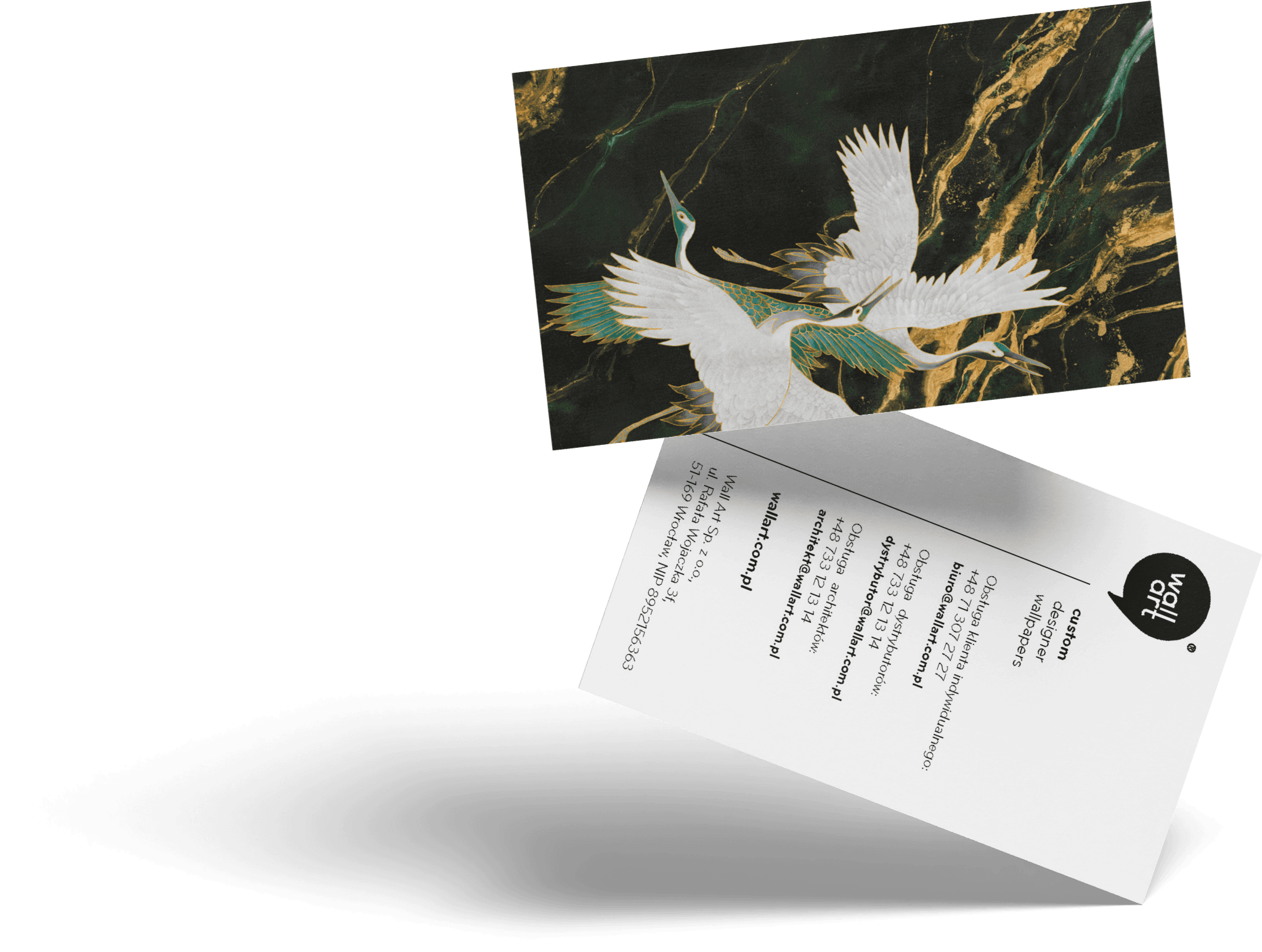
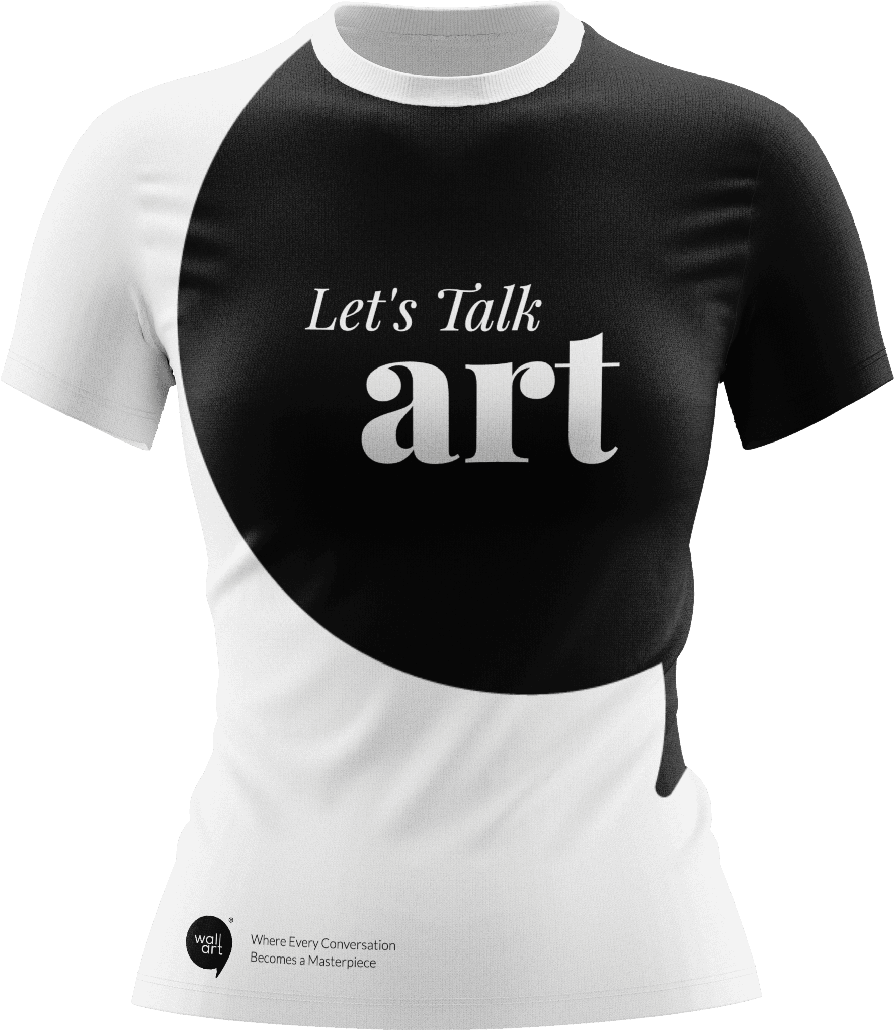
To bring WallArt’s brand identity to life in tangible form, I developed a range of print designs that highlight the brand’s sophisticated yet approachable aesthetic.
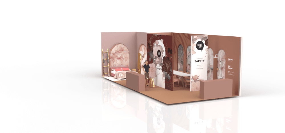
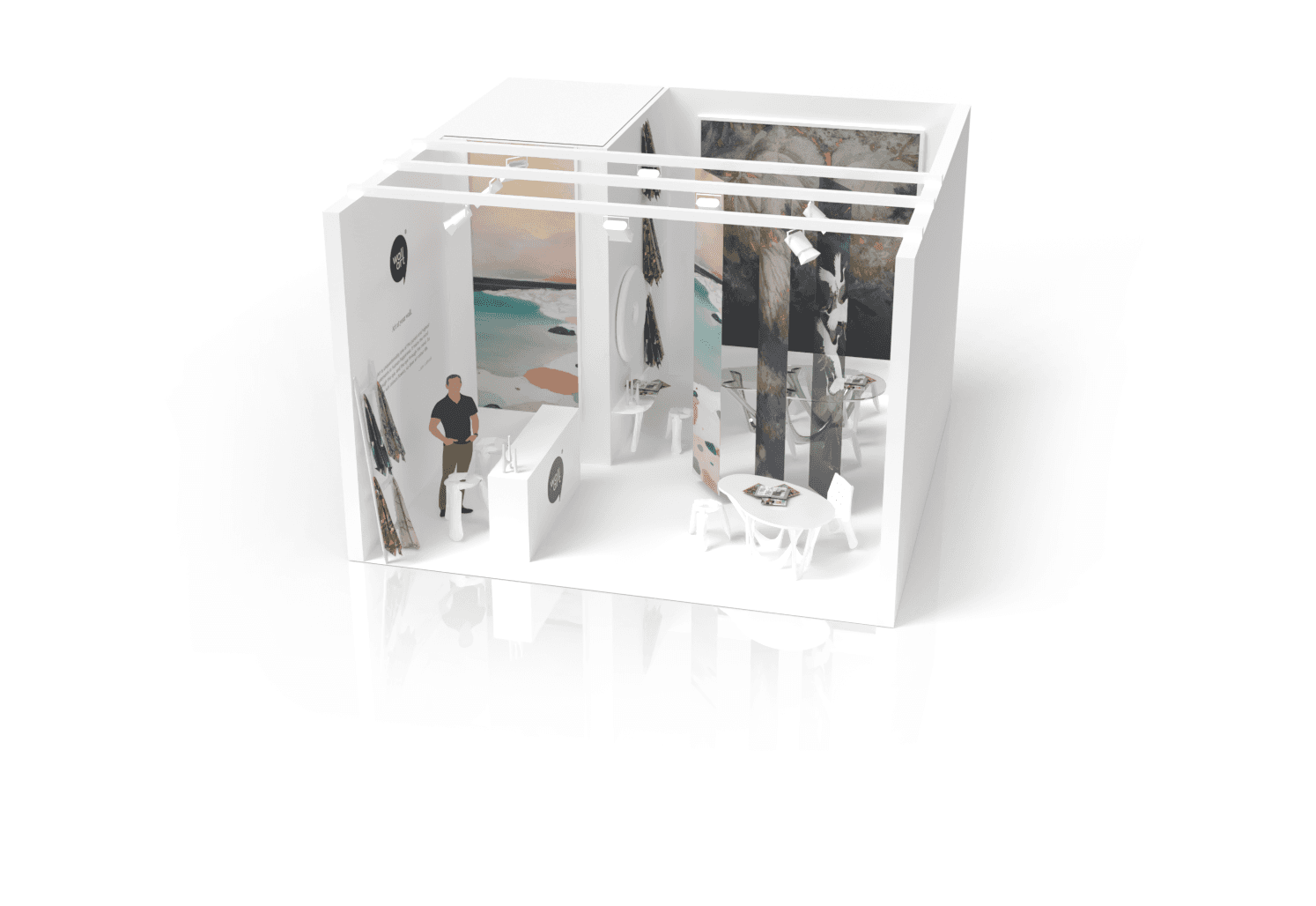
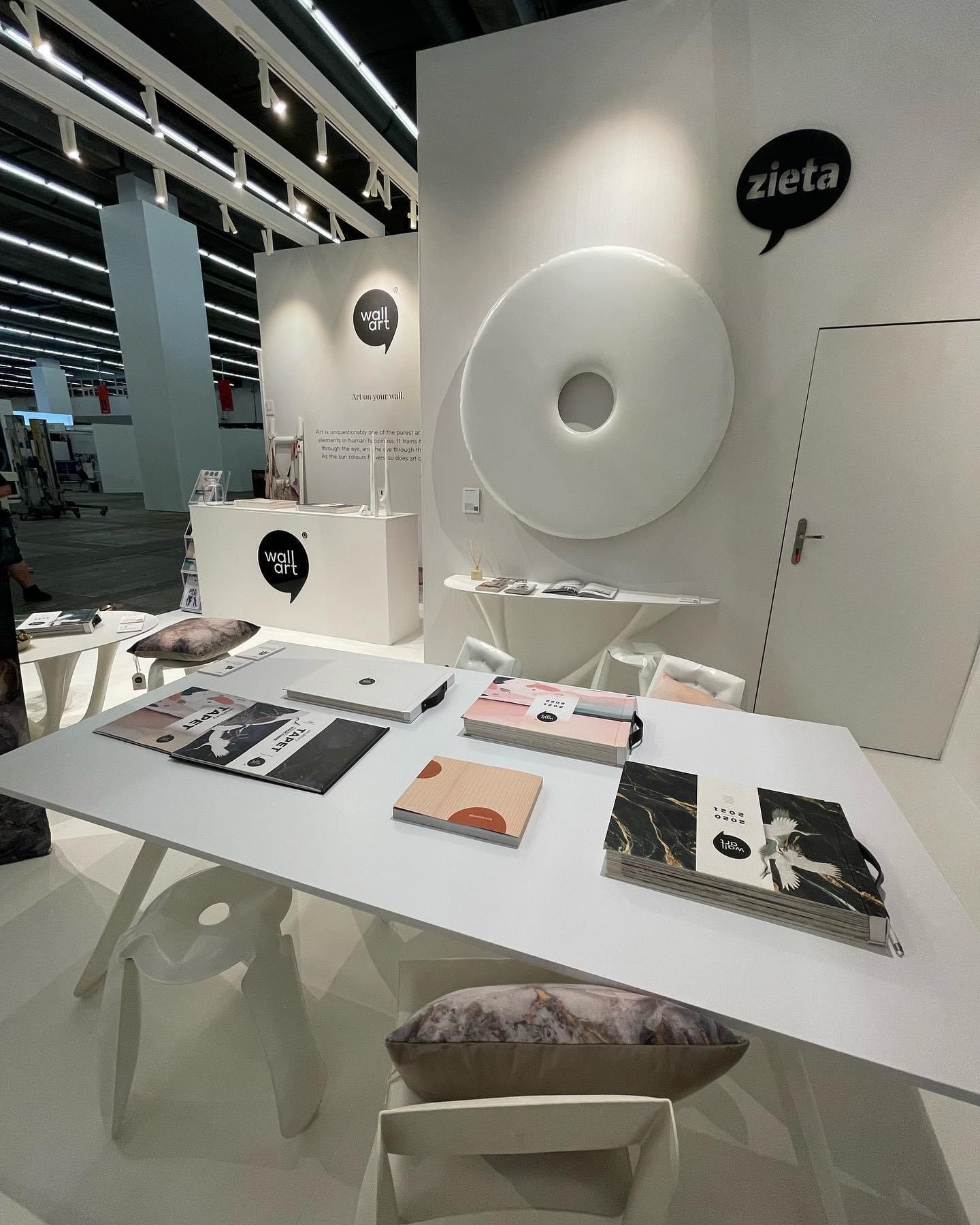
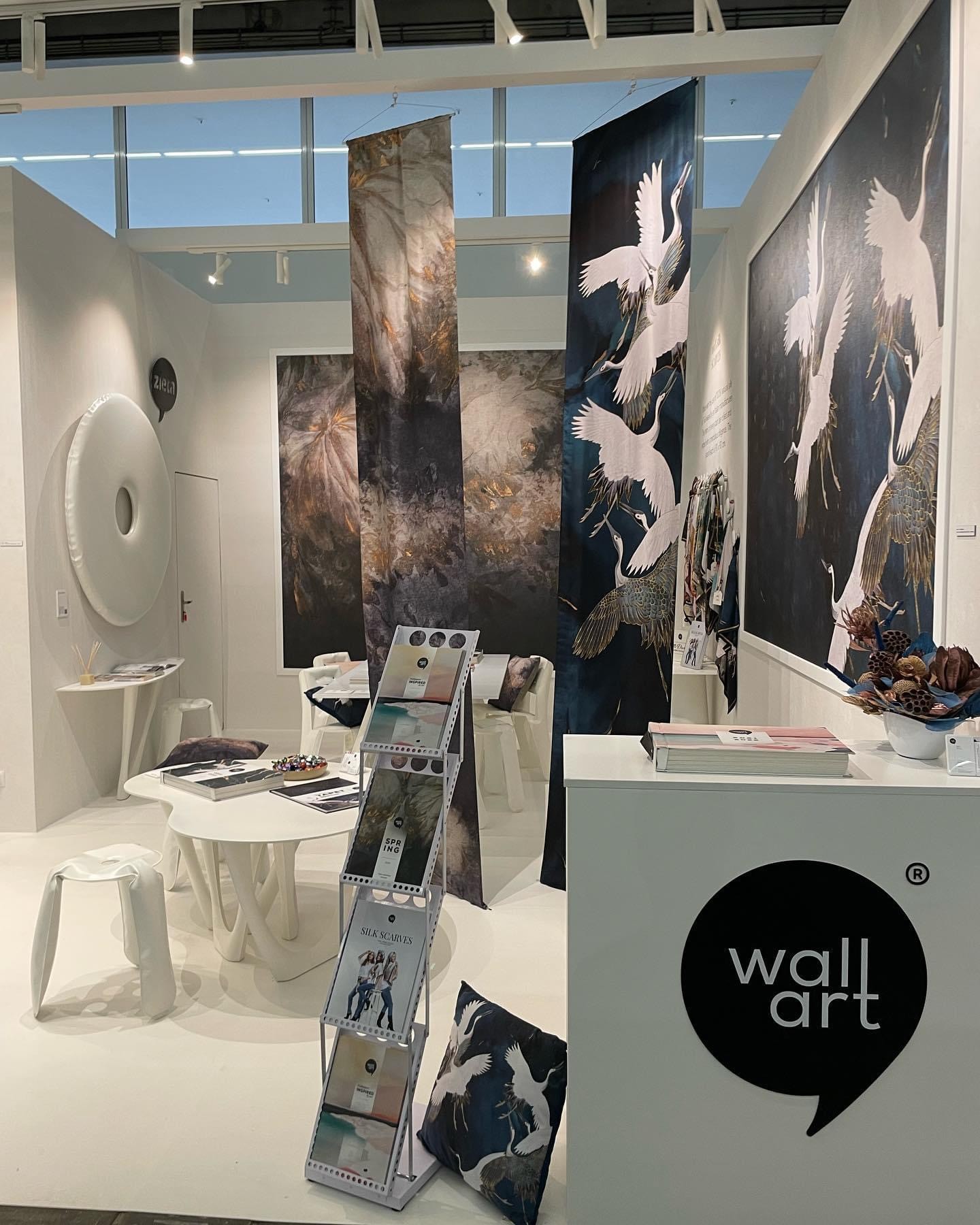
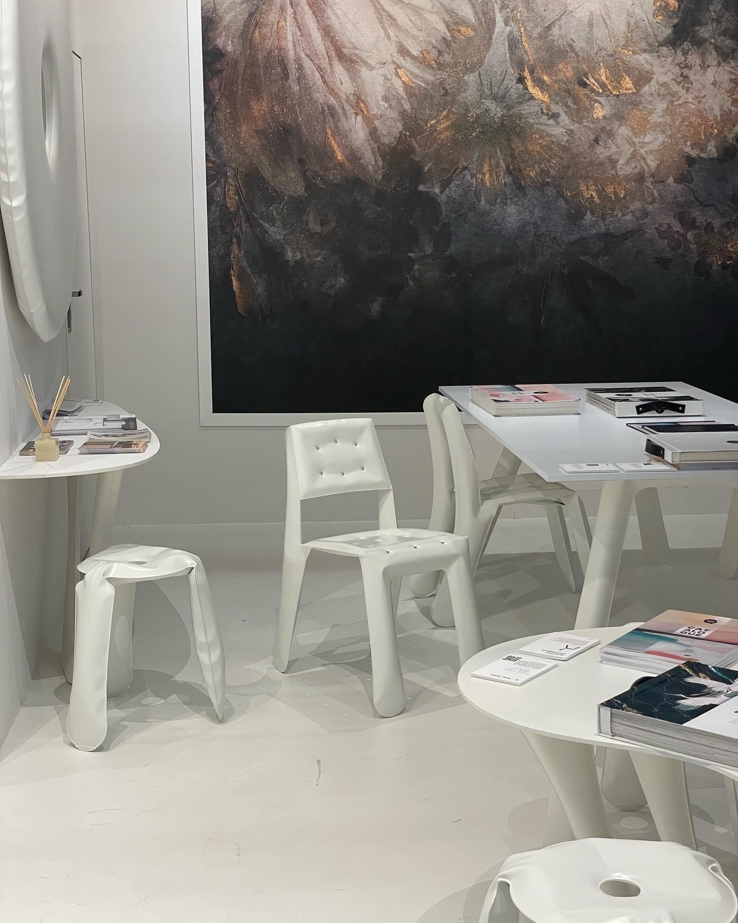
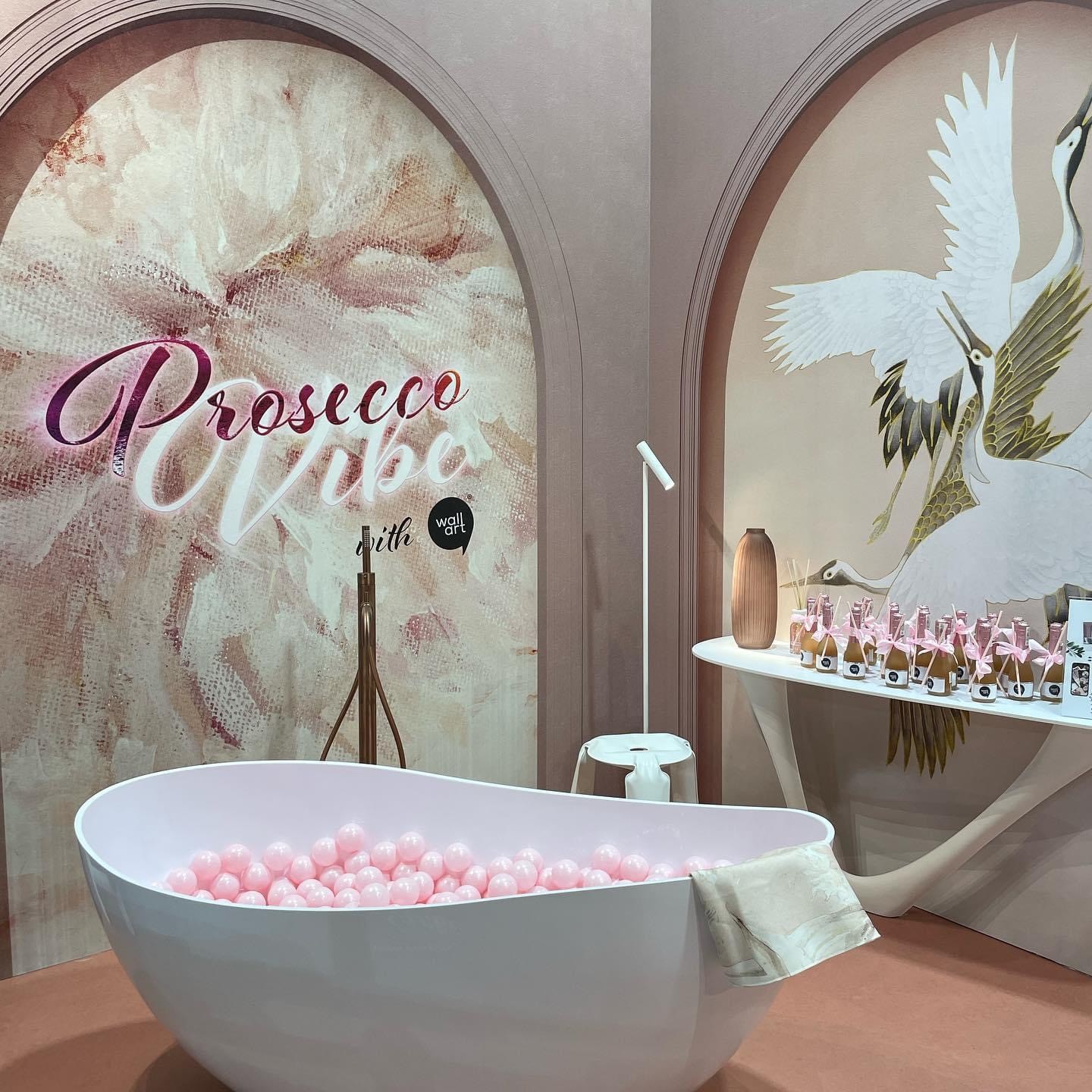
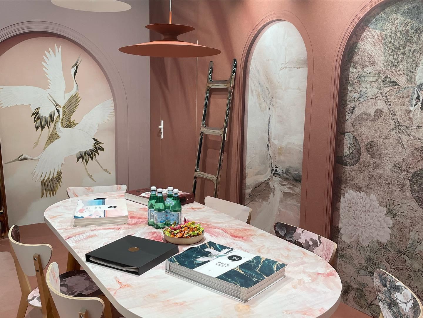
When designing the exhibition booths, I aimed to create spaces that would immerse visitors in WallArt’s world.
The booths were designed with a balance of elegance and approachability, making them both visually stunning and inviting.
3D renders were used to showcase these booths, ensuring that they aligned with the brand’s values and provided an impactful experience for visitors.
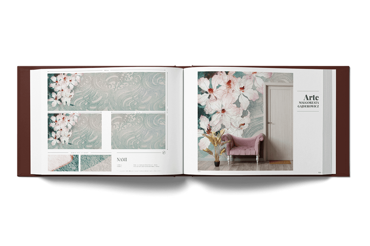
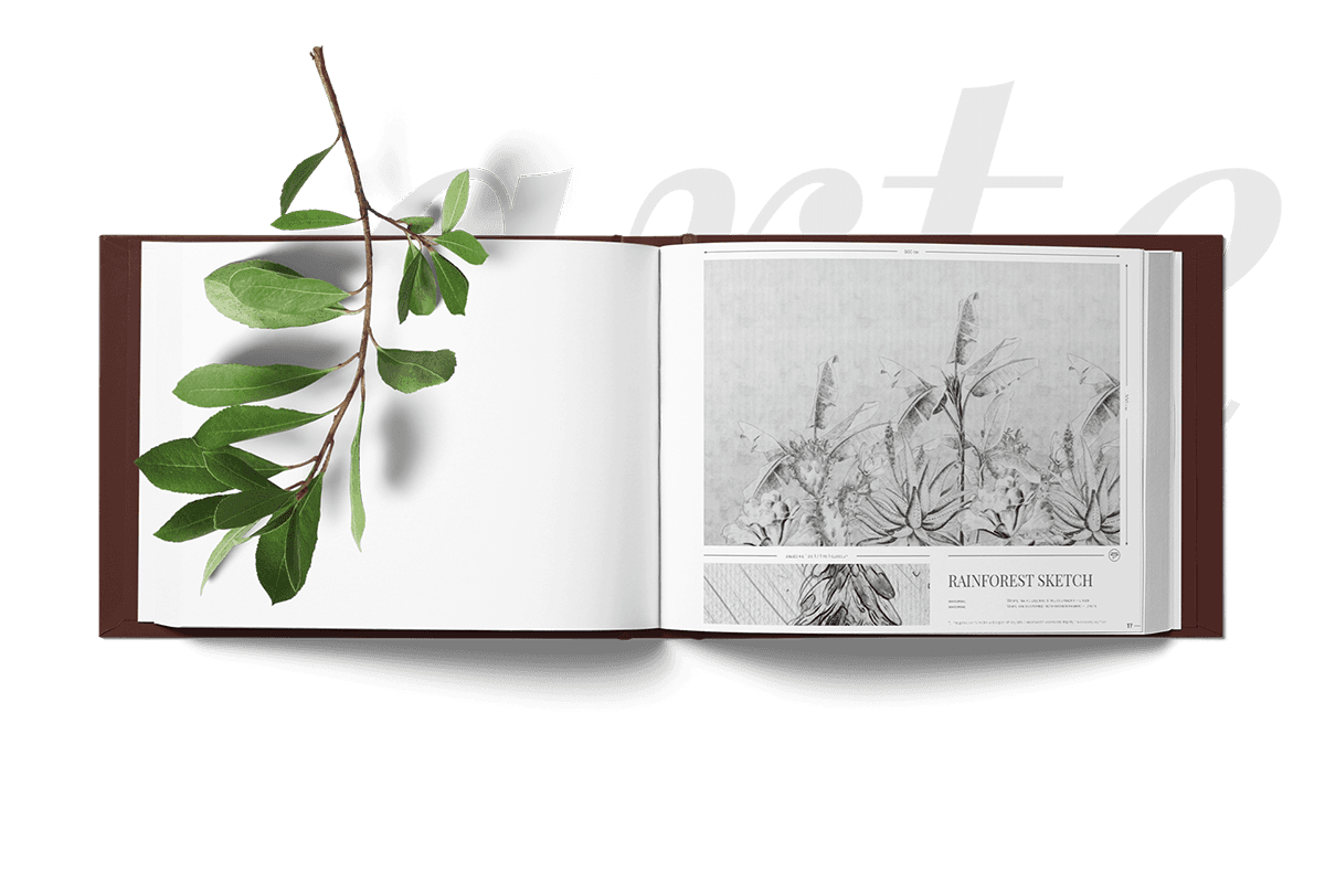
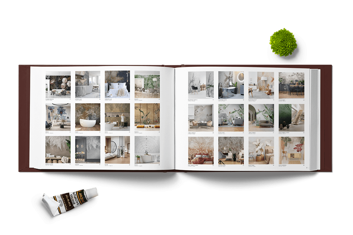
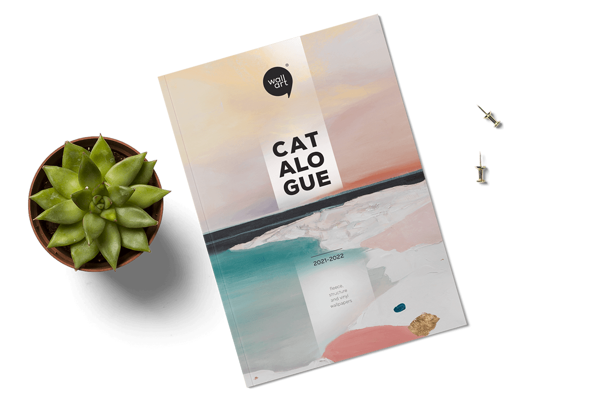
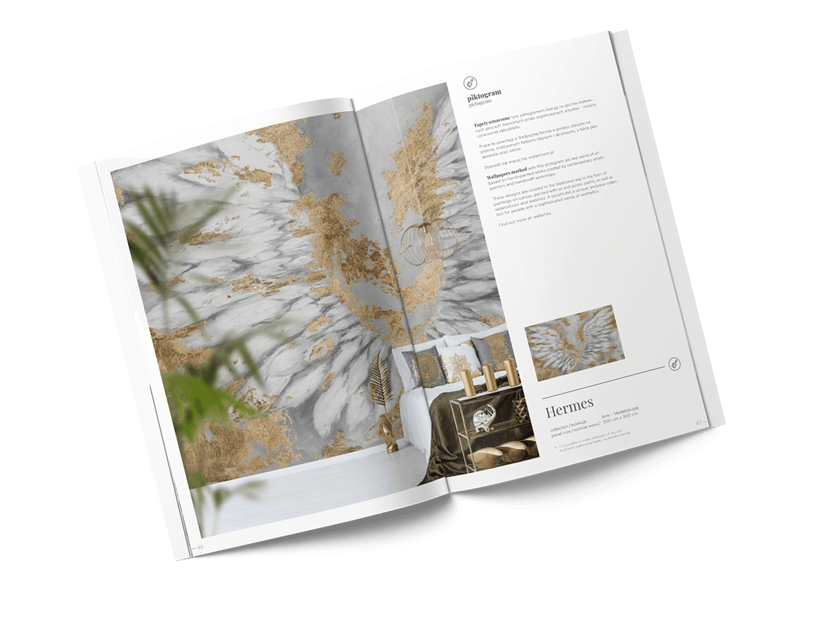
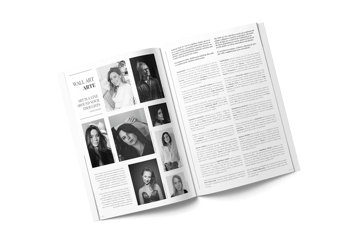
The creation of WallArt’s product catalog was guided by a desire to convey the unique tactile experience of the wallpapers. To achieve this, I selected a special foil for the catalog cover, designed to replicate the smooth, luxurious feel of WallArt’s textured wallpapers. This decision was crucial in creating an immediate, tangible connection between the product and the client, enhancing the overall brand experience.
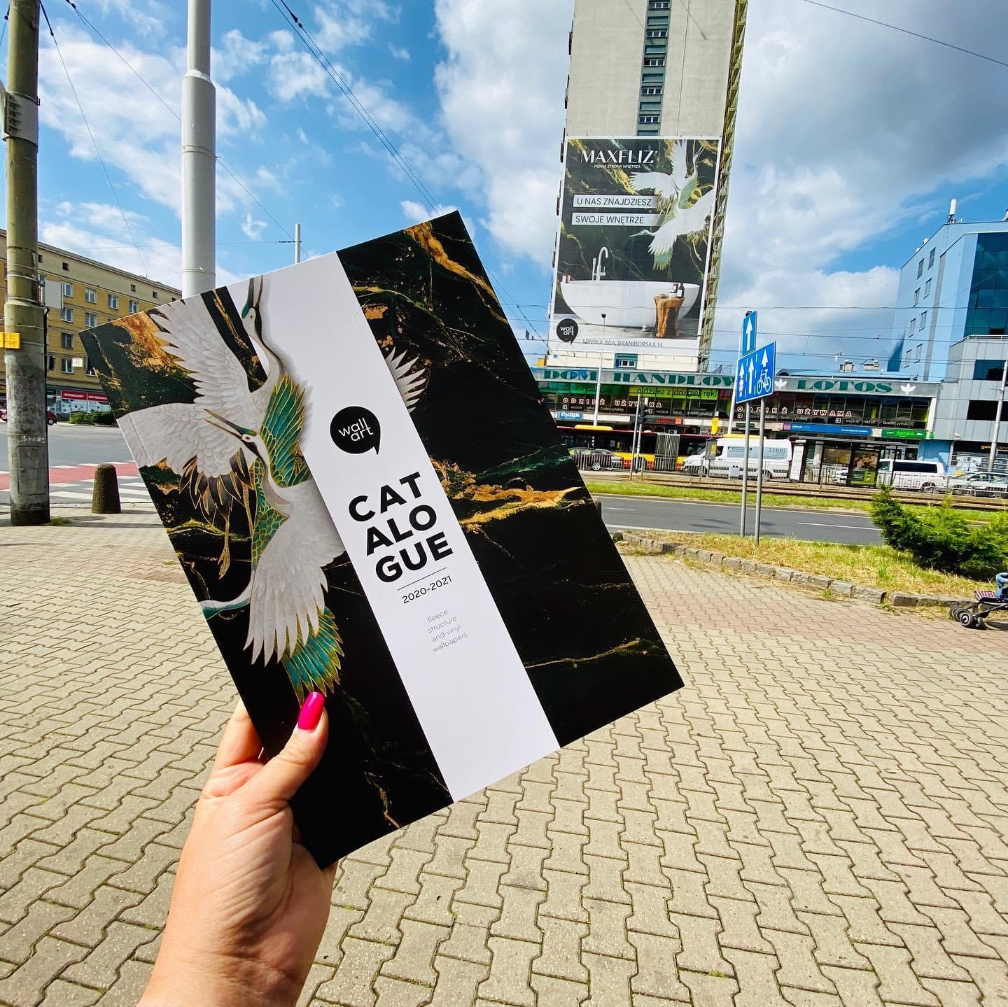
Catalogue
2020
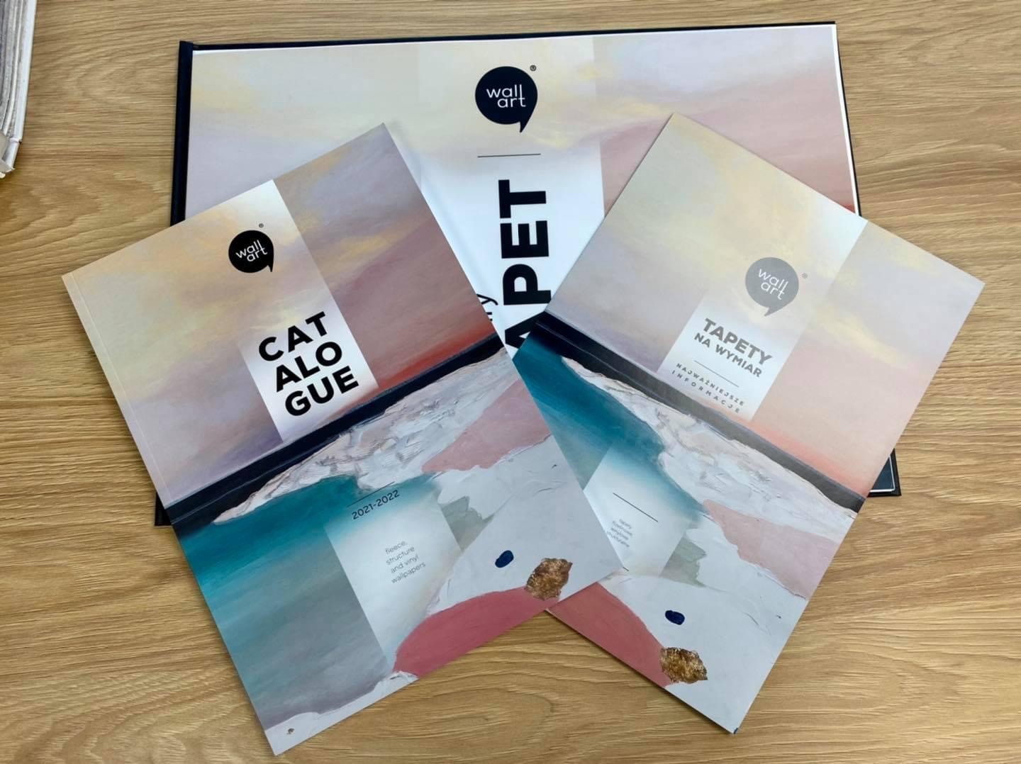
Catalogue
2021
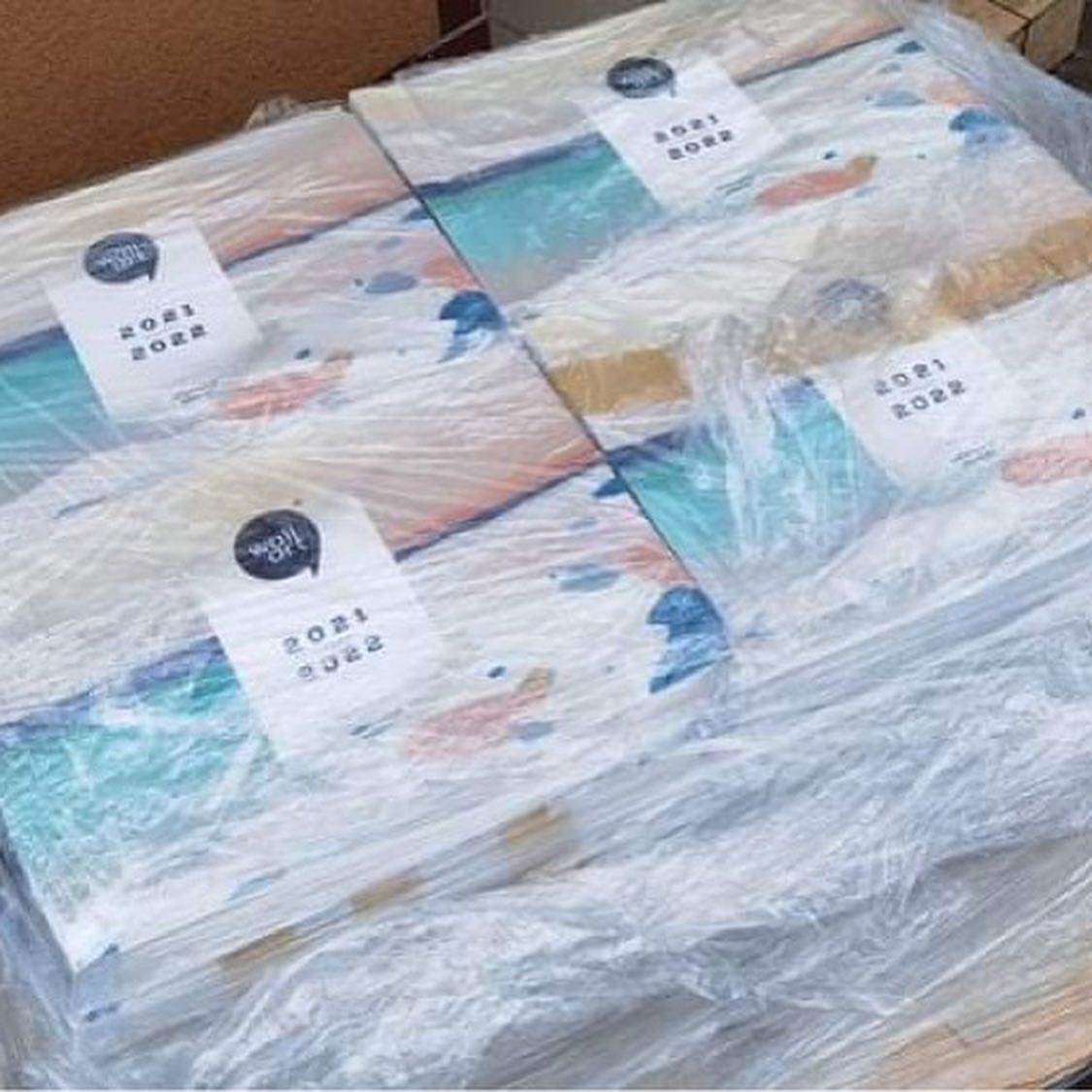
Sample Books
2021
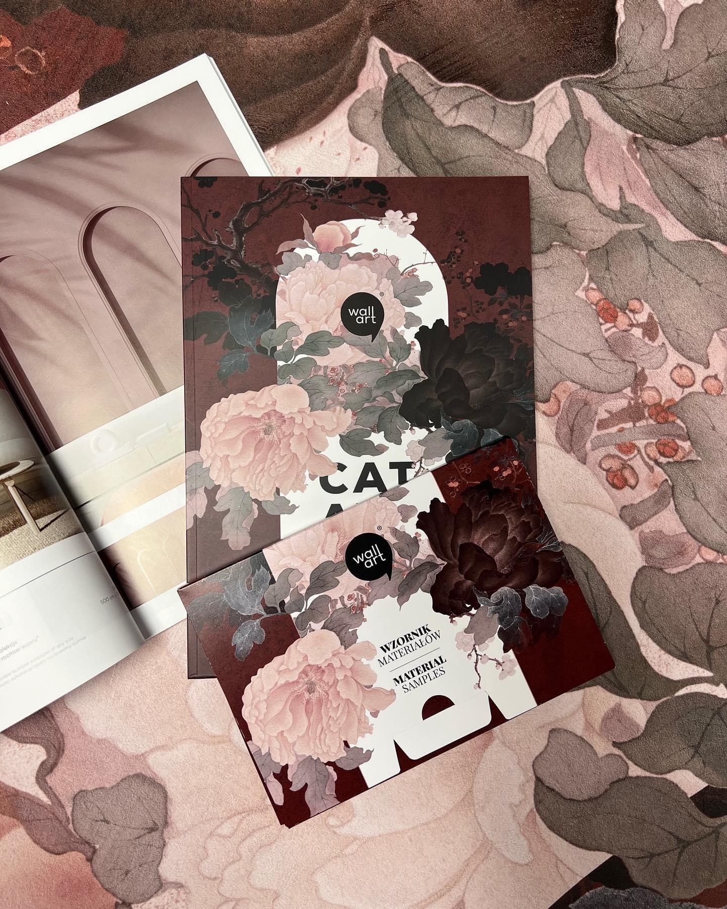
Catalogue
2022

Catalogue
2020

Catalogue
2021
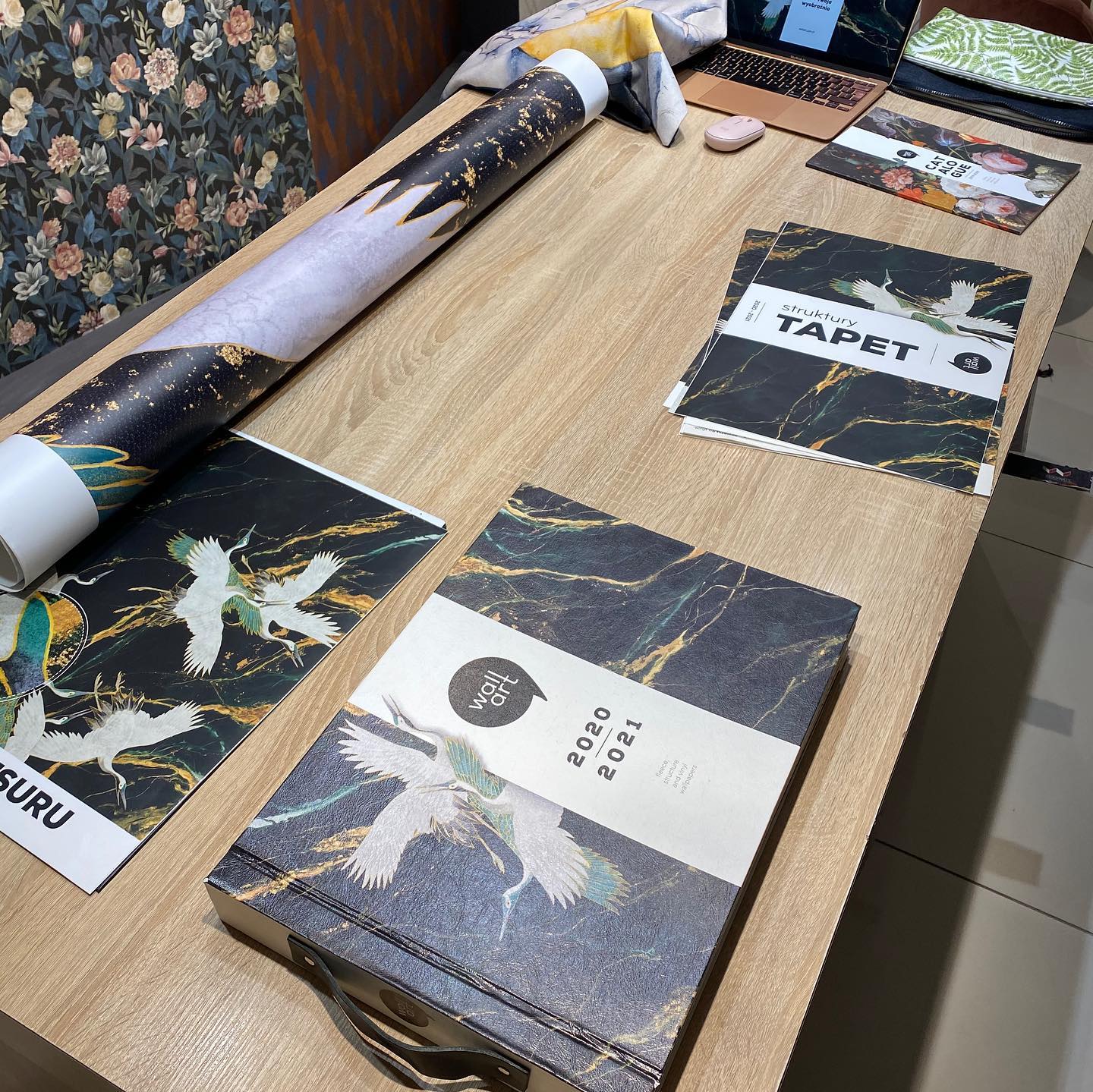
Warsaw Home
2022
Custom Shopify Website: For the website, I chose Shopify due to its robust e-commerce capabilities and user-friendly interface. I customized the platform to meet WallArt’s unique needs, focusing on key functionalities:
Price & Wall Size Calculator: I developed a custom calculator to help clients easily determine the cost and size of their bespoke wallpapers, making the purchasing process seamless.
Material Picker: I integrated a material picker that allows clients to choose from a variety of wallpaper materials, enhancing the personalization experience.







Other work
Scroll ↓


